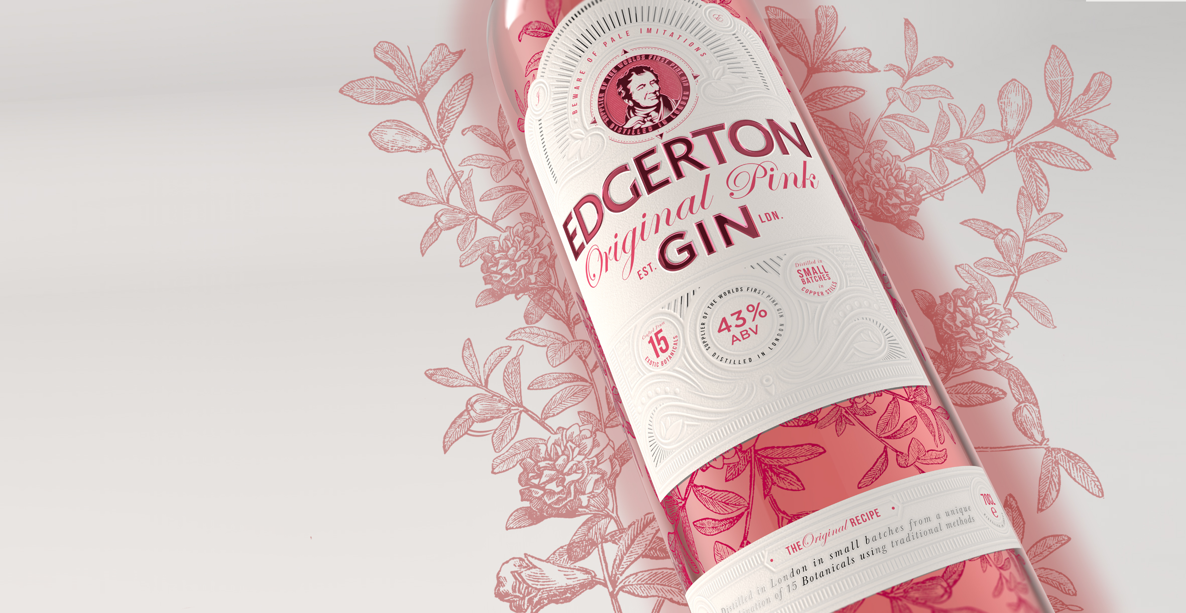
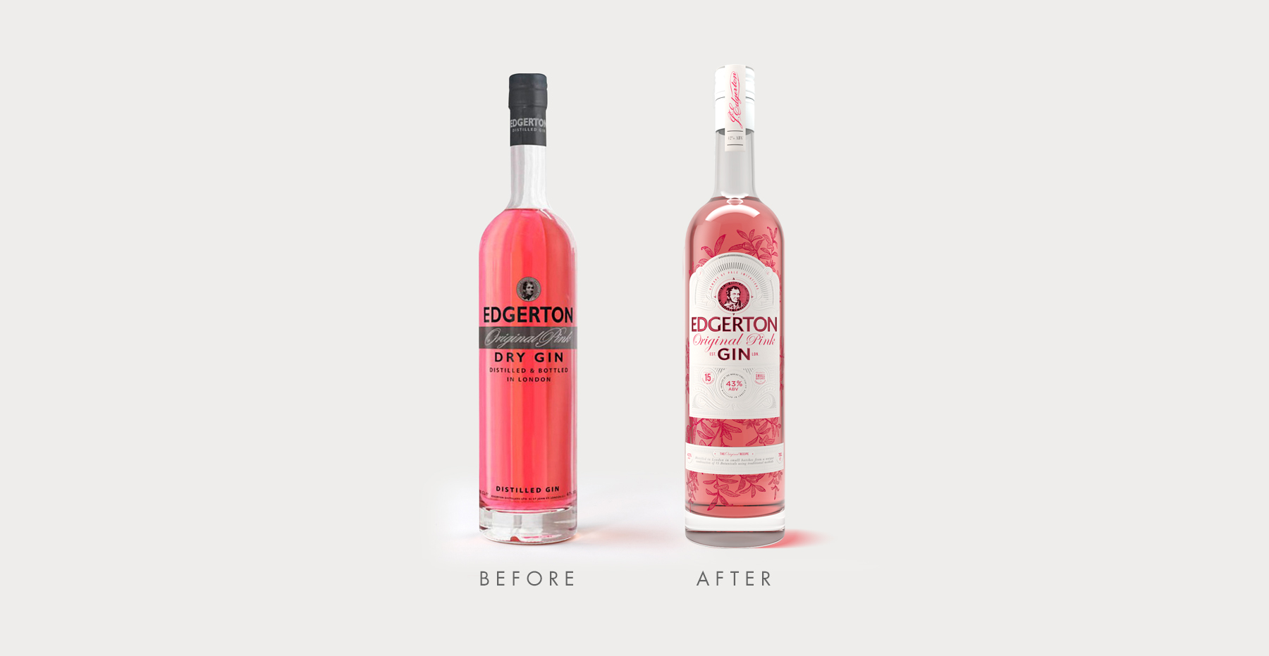
EDGERTON PINK GIN
Brand Redesign / Packaging Design
The Brief
While pink gin dates back to the 1800s, Edgerton pink gin is a relatively new phenomenon. So to give the brand authority, we needed to give it heritage, a look born out of quality and authenticity. Done well, this enticing new tipple could stand out among the better-known premium spirits on the shelf.
Our Approach
We wanted to give the brand a visual stamp of authenticity so we set about reworking the image of our pink gin creator, Lord Edgerton, in the style of a traditional woodcut portrait. The look was instantly iconic. Delicate illustrations hint at the fifteen exotic ingredients used to create the drink’s complex taste.


"I HAVE WORKED WITH DESIGN HAPPY ACROSS A NUMBER OF NPD AND BRAND IDENTITY PROJECTS. I THOUROUGHLY ENJOYED WORKING WITH THEM THROUGHOUT THE BRIEFING AND CREATIVE PROCESS, AND WAS ALWAYS IMPRESSED WITH THE WAY THE TEAM WERE ABLE TO TAKE THE BRIEF TO A WHOLE NEW LEVEL IN TERMS OF QUALITY OF DESIGN CONCEPTS AND THEN TO PROGRESS IT EFFICIENTLY TO A GREAT FINAL PACK DESIGN AND CORE BRAND IDENTITY"
JOHN JEFFRIES (BRAND MANAGER, LONDON DISTILLERS)

OTHER PROJECTS