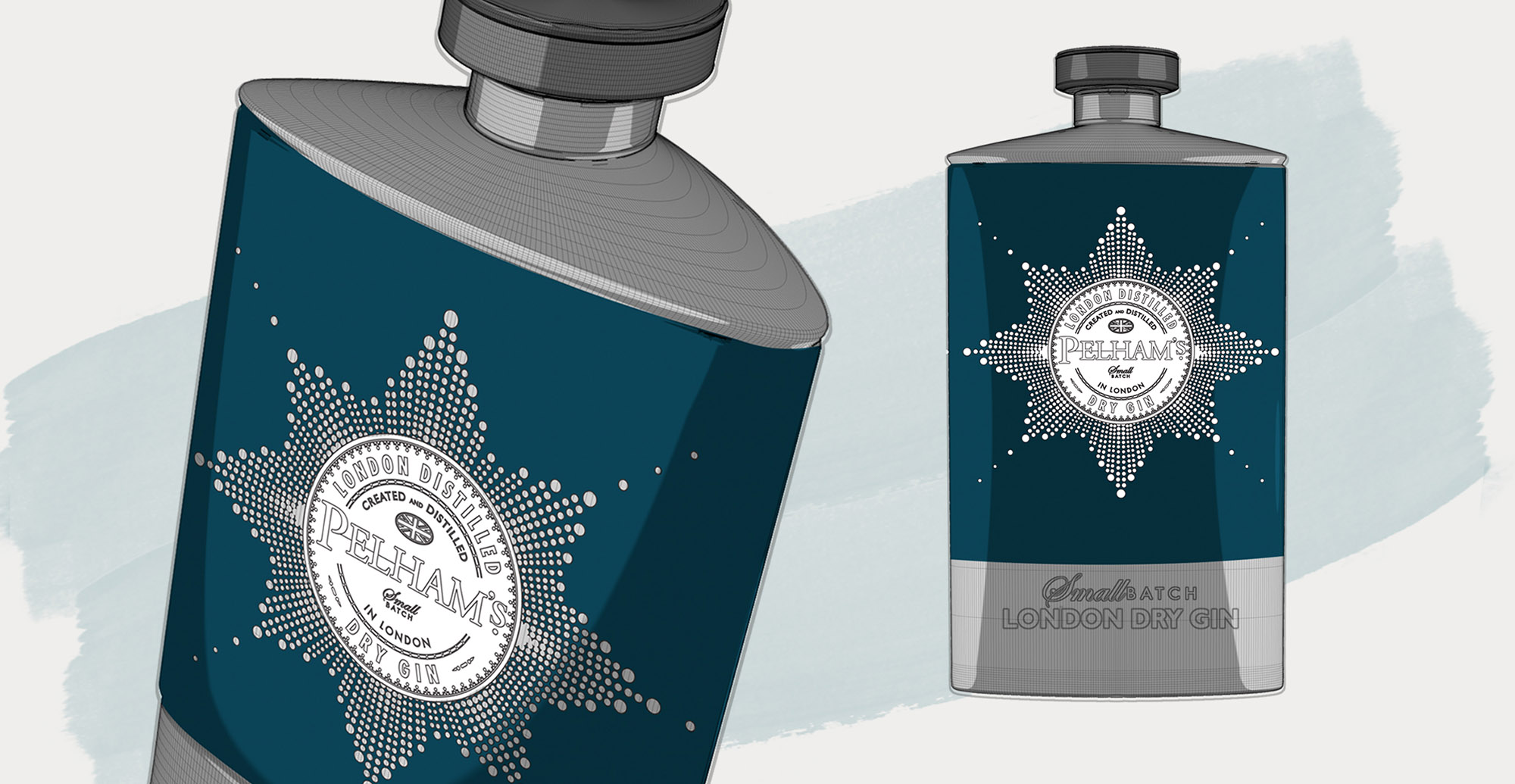
Pelhams Gin
Brand Creation / Packaging Design
The Brief
The London Distillery Company wanted to launch a new gin that appealed to a global market. So there was only thing for it: to give ‘em the best of British.
Our Approach
The police badge inspired the graphic holding device for the Pelham’s logo while the bottle itself was designed to resemble an old fashioned hip flask. We then triangulated the cross section of the bottle to add a touch of modernity and bring these historic influences up to date.

"I WAS ALWAYS IMPRESSED WITH THE WAY THE TEAM WERE ABLE TO TAKE THE BRIEF TO A WHOLE NEW LEVEL IN TERMS OF QUALITY OF DESIGN CONCEPTS AND THEN TO PROGRESS IT EFFICIENTLY TO A GREAT FINAL PACK AND CORE BRAND IDENTITY"
John Jeffries (Brand Manager, London Distillers)

OTHER PROJECTS